Astonishing
Further to the headlines garnered by the ‘astonishing’ rise in housing benefit claims by people in work….
I’ve managed to get hold of the dataset underpinning the Labour DWP team analysis.
It lists by locality the number of claims by employed people and the number of total claims for May 2010 and November 2013, and the percentage increase in each between the two dates.
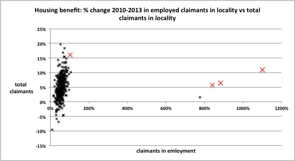
The INDEPENDENT EXCLUSIVE highlighted the percentage increases in Croydon, Uttlesford, Fareham and Boston. I’ve marked these in red on a chart with a simple presentation of the data: plotting the percentage increase in employed claimants against increase in total claimants. No comment necessary on this really!
Figure #1
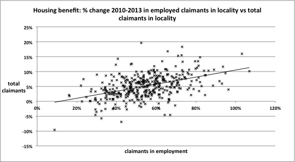
Let’s take away the four outliers from the other near-400 localities. The plot changes to something clearer, and we can see an apparent trend with the increase in claims by people in work perhaps unsurprisingly associated with increases in total claims. Result nonetheless!
Figure #2
But remember the data was presented to
expose the complete failure of David Cameron’s government to control housing benefit spending because more people are struggling to get their pay to cover their rent
Well as I pointed out on Monday you can’t infer that failure without considering whether the increase is caused by ‘workers newly claiming’ or ‘claimants newly working’.
It’s quite simple to use the data to have at least a look at that, by subtracting employed claims from total claims to get the number of out-of-work claims and then compare change in out-of-work claims and in work claims. Taking away only two outlying localities, this shows quite a good correlation between rising in work claims and falling out-of-work claims.
Figure #3
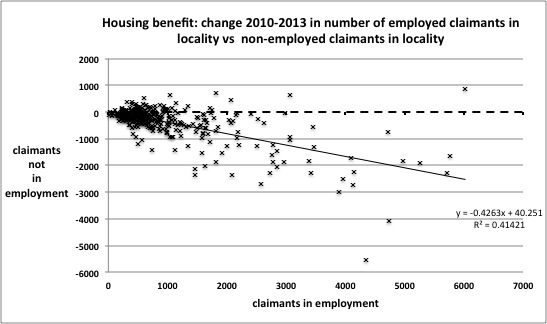
On the face of it, this suggests quite the opposite of the headlines, and that rather than workers increasingly struggling to pay their rents and turning to the state for help, that out-of-work claimants are increasingly getting jobs. That is I think probably the more meaningful result from this data. Hard to extract? Not really.
As housing benefit is means-tested, it might be possible to check this result further if the value of the claims in question were known, as moving into work and increasing income would reduce the amount of an individual’s claim, and produce some change in average values of in work and out-work claims either overall or correlated with change in numbers or ratio by locality.
Finally, it’s quite possible bearing in mind my initial look at the overall claims data from the LFS that the swirly mists of migration are getting in the way, and I’ll see if these can be blown away at all now I have the locality data ...
Some other puzzlers ...
Resolution Foundation
The newly self-employed are likely to be suffer from some vulnerability and insecurity. But they don't appear to be much different in any key characteristic from the existing self-employed. Link to their report is here
Morgan Stanley
There are five key drivers of increases in UK self-employment. Overall these suggest the growth derives from weakness in the economy and is a sign of slack. Their report should download here.
Steven Toft (@FlipChartRick)
Increased self-employment doesn't appear to be necessarily a good thing, looked at internationally and macro-economically here
Benedict Dellot from the RSA
Growing self-employment results from opportunity not necessity, and suggestions to the contrary are myths to be busted here
Adam Lent from the RSA
High self-employment rates aren't a sign of economic weakness, but stirring entrepreneurial spirit here
TUC
The growth of self-employment is part of a trend towards casualised work, likely to hold back wages, and prevent people from having the kind of secure employment they need to pay their bills, save money and plan for the future here