A diversion ...
Now the self-employment puzzle is only part of a much bigger labour market puzzle, and Jonathan Portes has just put out an excellent piece on that (see to the side or below). While pondering on it I stumbled across a piece of ad hoc research published by the Office for National Statistics in response to a Freedom of Information Act request and got quite distracted. These things don’t always get the attention they deserve, as although the ONS website has a section devoted to them, they aren’t exactly publicised, and the titles do not always reveal what interesting stuff might lie within.
Anyway, the piece downloads as a spreadsheet here, and it shows labour market participation by country of birth. Nothing new there you might say – you get employment levels regularly in EMP06. But this gives a run of figures for employment, unemployment and inactivity for all non-UK born, those who have been here for up to two years, and those here for up to five years.
This has the potential for interesting insight into possible impacts of migration on the labour market from how quickly and easily migrants to the UK appear to have got jobs (or not). And there’s a tantalising sequence of wages data too.
In the words of the ONS description of the metadata, they identified three groups of people:
- "Immigrant is defined as someone born outside the United Kingdom, but who now resides in the United Kingdom
- Recent Immigrants are defined as foreign born individuals who arrived in the survey year or at some time in the previous four (calendar) years.
- New Immigrants are defined as foreign-born individuals who arrived in the survey year or the preceding claendar (sic) year."
The tabulated numbers allow rejigging these groups into people born abroad who at each annual point have been in the UK for:
- over five years (subtracting the second group from the first)
- two to five years (subtracting the third group from the second group)
- up to two years (the third group)
Using these new groupings, the picture for employment looks like this
Figure #1
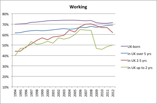
Clearly, if I had been born abroad and resident in the UK in 1994 I would have been much more likely to be working if I had been here for more than five years than if I had not. On the other hand, it would not have made much difference whether I had very recently arrived or not, employment rates being little different between the ‘up to two years’ and ‘two to five years’ groups. The likelihood of being in employment in both of these groups was much the same, but the chance increases from year to year as we go through the nineties.
The two groups diverged from 1998, but the difference between them remained fairly constant until 2007. At this point, the employment level faltered for newer arrivals while for those who had been here for between two and five years, their employment level exceeded that for generally longer-term migrants. Employment prospects appear to have fallen off a cliff between 2008 and 2009 for subsequent arrivals: so for example in 2010, those who arrived in that year and in 2009 saw employment levels back to where they were for their equivalents in 1995. The lagging change in employment level for those in the ‘two to five year’ group, particularly the downturn from 2011 to 2012, suggests that loss or lack of employment was not necessarily associated with leaving the UK for better prospects elsewhere.
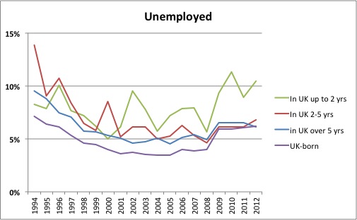
Checking this against unemployment, the lines are a bit jaggedy, presumably because of smaller sample size, but there is certainly the appearance of a trend, suggestive of people continuing to come to the UK despite diminishing job prospects in the recession, and for an increasing proportion actually not being able to find work within two years of arrival. The unemployment level of the most recent arrivals – in 2012, those who arrived in 2011 and 2012 is really much higher than of any other group.
Figure #2
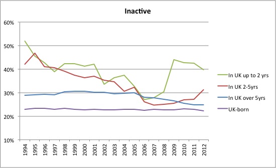
This is all consistent with the narrative of increasing positive migration associated with people coming to the UK with its open and rewarding labour market primarily to work, and although in fact rather stymied by recession, not sufficiently so to put people off to any great degree. However, the figures on inactivity do raise something of a question. Looking at the chart below, why would there have been such a divergence between the newest and immediately previous arrivals from 2008? A Twitter suggestion was increasing numbers of students, but if there is a student dimension it would seem more likely to be because of a smaller overall denominator rather than an increasing student numerator. I shall give this some further thought, but the lagging ‘two to five year’ group also turned up sharply, and this group should not contain a very high proportion of students, bearing in mind the length of a typical course. And the change in trend for both groups is well out of line with that for longer-term migrants.
Figure #3
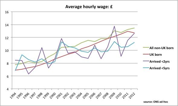
Overall these figures suggest, albeit only suggestively, that continued high levels of migration persist despite much reduced job opportunity, something perhaps that is something of an influence on the productivity puzzle that Jonathan and others are puzzling over. In this context, as I said at the start of this piece, the wages data is rather tantalizing. What could we say about this? Well taken together with the data illustrated above, a possible conclusion is that there is some downward pressure on wages from migrants both in employment and available for employment.
Figure #4
prompts and links ...
Jonathan Portes
Writing in Financial World, Jonathan puzzles over the lack of productivity rebound from recession, and wonders whether ground has been lost permanently here.
Steven Toft (@FlipChartRick)
Always worth reading here
Office for National Statistics
The data used is in a spreadsheet that downloads from their site here