Straw men?
The Resolution Foundation’s latest on self-employment in the UK by Laura Gardiner here looked at measuring self-employed income, rightly identifying the some of the 'known unknowns' and wondering how we can identify and keep track of these figures that really matter.
FlipChartRick blogged on it today here, including a chart of changing tax credits recipt so just a short piece from me to provide a little more detail on that.
And before anyone stops reading - a reminder that everyone interested in self-employed income should also read Richard Murphy’s very close analysis for Tax Research UK of what HMRC taxpayer data shows here.
As FlipChartRick points out, another straw in the wind on self-employed income comes from benefit receipt. Tax credits provide means-tested benefit for people in work as well as out of work. HMRC publishes lots of interesting statistics on tax credits, including income levels of recipients, but don't distinguish between employees and the self-employed.
But the ever-faithful Labour Force Survey asks people about their employment status and about all the benefits they are receiving. You have to be a bit cautious about using Labour Force Survey data to estimate benefit receipt, but the numbers for tax credits recipients track the administrative data from HMRC on actual numbers of claims quite well enough for the purposes of this illustration.
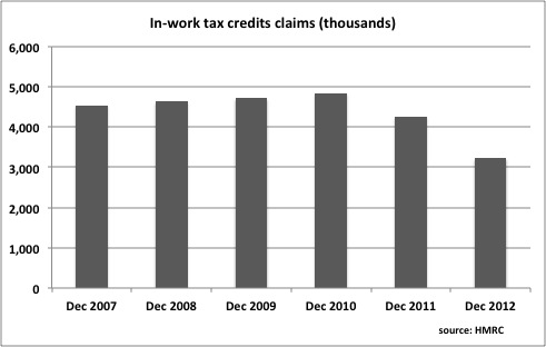
If you look at trend for tax credits from HMRC data, it’s clear that the number of claimants has dropped significantly since 2010. That doesn’t mean anyone is getting any better off! It is because while tax credits are means-tested, once the amounts paid had been tapered off with rising income to nil, historically a flat rate ‘family element’ continued to be paid to families with children earning up to £50,000 a year until abolished in mid-2012.
That took a million families out of tax credits altogether by the end of the year, leaving the remaining claimants all on ‘lower’ incomes.
Figure #1
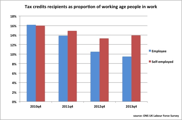
What’s interesting is that the picture below from LFS data suggests that all of the hit seems to have been taken by employees, with only a very small drop in self-employed claimants. As for the self-employed it is proportionately very much lower it could mean that there were proportionately fewer self-employed receiving the family element only. But aside from a long tail, the distribution of self-employed income isn’t that much different from distribution of employee income. This seems to suggest that there was probably was a significant number of self-employed taken out of tax credits just as a significant number of employees were taken out, so that if the number of claims didn’t change very much, there must have been nearly as many new claimants at the bottom end as were removed from the top end.
Figure #2
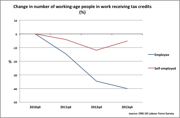
This effect should have worked itself out by the end of 2012, and the subsequent drop in employee recipients suggested by the LFS again unlikely to derive from people becoming better off overall, but from continued further restrictions on eligibility (largely change in working hours requirements). The picture below shows the magnitude of the drop in numbers over the period. Although in principle these subsequent changes should affect self-employed recipients similarly, and so reduce their recipient numbers further, their numbers went up. The LFS suggests that the rise of around 100,000 in working age self-employed during 2013 was accompanied by a rise of around 40,000 in self-employed recipients of tax credits. Now this doesn’t mean that 40% of the newly self-employed claimed tax credits - the increase in tax credit recipients could have occurred amongst the existing self-employed. But all other things being equal it does point to new self-employed incomes not being enough to get by on, and/or self-employed income falling to a much greater degree than for employees.
Figure #3
The words of the original Resolution Foundation report on the growth of self-employment can as well be applied to their new work on income measures:
The analysis paints a worrying picture of the security and vulnerability of self- employed people on both a short and long term horizon
Some other puzzlers ...
Resolution Foundation
Original report on how the newly self-employed are likely to be suffer from some vulnerability and insecurity. But they don't appear to be much different in any key characteristic from the existing self-employed. Link to their report is here
Morgan Stanley
There are five key drivers of increases in UK self-employment. Overall these suggest the growth derives from weakness in the economy and is a sign of slack. Their report should download here.
Steven Toft (@FlipChartRick)
Earlier blog on increased self-employment doesn't appear to be necessarily a good thing, looked at internationally and macro-economically here
Benedict Dellot from the RSA
Growing self-employment results from opportunity not necessity, and suggestions to the contrary are myths to be busted here
Adam Lent from the RSA
High self-employment rates aren't a sign of economic weakness, but stirring entrepreneurial spirit here
TUC
The growth of self-employment is part of a trend towards casualised work, likely to hold back wages, and prevent people from having the kind of secure employment they need to pay their bills, save money and plan for the future here
Jonathan Portes
Writing in Financial World, Jonathan puzzles over the lack of productivity rebound from recession, and wonders whether ground has been lost permanently here.