The self-employment puzzle: a piece of the jigsaw?
It’s reported that even the Bank of England is ‘puzzling over’ the figures on growth in self-employment.The ONS recently felt it worth carrying out some analysis and selecting a period from 2008 to 2013, it highlighted that older people have contributed most to the rise in self-employment from 2008 to 2013 in its April 2014 Economic Review. This noted “The self-employment share rises smoothly through the age groups from around 5% of total employment for those aged 18 to 24 to around 38% of those aged 65 and above.” And concluded “together the 50 to 64 and 65 and above age categories account for just over 70% of the rise in self-employment over this period”
The ONS data is presented in a table that produces a chart showing that likelihood of self-employment does increase with age, with an apparent smooth and direct upward trend for working-age age groups.
Figure #1
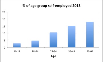
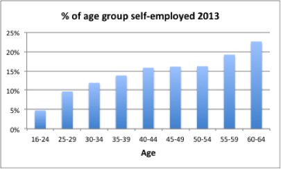
But the age-groups used have quite different spans, respectively 2, 7, 10, 15 and 15 years. A more nuanced picture is given by using even 5-year spans, aggregating only the under-25s. This shows the rise flattening out at 40, and only restarting at 55.
Figure #2
Looking at the changes that have led to this present picture, the ONS selection of data shows how change in self-employment within age-bands has contributed to overall change in self-employment. It’s from this that they get their headline that 70% of the change in self-employment has been driven by older people.
Figure #3
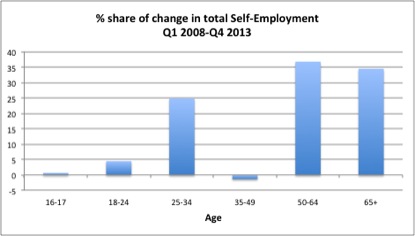
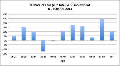
But the uneven bundling up again obscures detail, in particular the very different change within the 35-39 and 45-49 age bands, and within the 50-59 and 60-64 age bands.
Figure #4
This is a rather more complex picture, and to put these percentage changes in context, let’s look at overall self-employment levels using even 5-year spans between the two periods chosen by ONS.
Figure #5
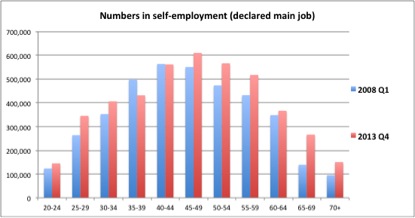
Superficially, this shows increases in self-employment levels for older groups in particular. But obviously, the similar shape of curve and the fact that the 5 year span for the age bands is little different from the comparison period of 5¾ years chosen by the ONS suggests there is some change occurring from simple ageing. The population within each age band in 2008 is of course in the next higher age band in 2013. Let’s see the extent to which this might be part of the explanation for the change in self-employment levels among older people.
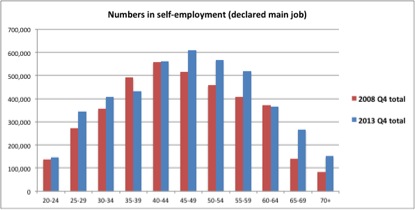
Firstly, the start of the period is changed from Q1 2008 to Q4 2008 so that the interval between the start of the period and the end is now five years, removing a bit of seasonality and making the period for comparison the same as the span of each age band. Some difference is observable, although the general shape is preserved.
Figure #6
Secondly, the numbers in each age band in 2008 are shifted into the next age band as that is where that population would be in 2013. For example everyone who was 60-64 in Q4 2008 will be 65-70 in Q4 2013. The 70+ group in 2013 will include everyone who was already 70 in 2008 plus all of those who were 65-69 in 2008. Comparing the shifted 2008 numbers with 2013 gives a rather illuminating picture:
Figure #7
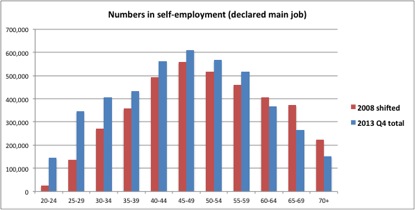
This points to the change in self-employment within cohorts, and unsurprisingly shows diminishing numbers once the age of 60 is reached. That is, as people age they increasingly stop working. In fact, what these numbers show is that there has been no net increase in self-employment since 2008 amongst those who were then aged 55 and over. Or to put it another way, of the group of people who were 55 or over in 2008, fewer are now self-employed (in 2013) than were in 2008.
Comparing these two charts, it seems more likely that the primary reasons for greater numbers of older self-employed is that there are increasing numbers of older people and/or that the self-employed are carrying on working longer, rather than that more older people are entering self-employment.
So while there is a narrow sense in which it may be true that the oldest age groups have contributed most to the increase in self-employment, it is not at all a meaningful result, and is very likely to be misunderstood if put like that.
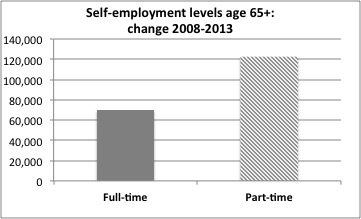
The data on whether employment is full-time or part-time also points to tapering off as an alternative to retirement, with nearly two-thirds of the ‘increase’ beyond working age being in part-time self-employment.
Figure #8
At the other end of the scale, the 20-24 band can be disregarded as this 2013 cohort would have been 15-19 in 2008. For the remaining bands, the increase in the number of self-employed for each band shown in Figure #7 suggest that it is in fact among the working-age population that increasing numbers of each of these age cohorts have taken to self-employment between 2008 and 2013.
The next question of course is if it’s not the old who are actually entering into new self-employment, who is it really?
Some other puzzlers ...
Morgan Stanley
There are five key drivers of increases in UK self-employment. Overall these suggest the growth derives from weakness in the economy and is a sign of slack. Their report should download here.
Steven Toft (@FlipChartRick)
Increased self-employment doesn't appear to be necessarily a good thing, looked at internationally and macro-economically here
Benedict Dellot from the RSA
Growing self-employment results from opportunity not necessity, and suggestions to the contrary are myths to be busted here
Adam Lent from the RSA
High self-employment rates aren't a sign of economic weakness, but stirring entrepreneurial spirit here
TUC
The growth of self-employment is part of a trend towards casualised work, likely to hold back wages, and prevent people from having the kind of secure employment they need to pay their bills, save money and plan for the future here